
Corporate identity is the way a company or organization identifies itself and distinguishes itself from others. It includes visual and communication elements that reflect the company's vision, mission and values, and expresses the sum of all visual and communication elements created by the institution to define its presence in the sector and its target audience.
These elements cover a wide range from the internal and external behavior of the institution to its communication strategies, philosophy and vision. Corporate identity is supported through the visual standards of the brand; These standards create the corporate stance and image of the brand. The goal is to increase the prestige of the brand, differentiate it from competitors and increase its recognition.
In the process of creating a corporate identity, the aim is for the brand to differentiate from other competitors and to have a distinct stance. This process strengthens the relationship between the brand and the customer and reflects the professional face of the brand. A successful corporate identity work supports the long-term success and reliability of the brand, therefore it is considered a sound investment.
In addition, corporate identity determines the brand's expression at the global level and its stance in the field in which it operates. Corporate identity, supported by internal and external communication, reinforces the brand's story and its bond with its target audience. This plays an important role in the overall strategic direction of the brand and strengthens perception. If you are unfamiliar with creating a corporate identity, BusinessUp, which is both digital marketing agency and graphic design agency ! You can contact.
What Does Corporate Identity Consist of?
1- Logo Usage and Color Standards Guide
Effective reflection of the brand identity is possible by using the logo correctly and consistently. This guide includes color and usage standards that determine how your brand's logo will be used in print and digital environments. Colors play a big role in cross-cultural communication and are a critical factor in increasing brand recognition. Continuous and correct use of colors ensures the consistency of the brand in both local and international markets.

Logo Usage Rules
1. Logo Size and Placement: The logo must be used in the correct size and position in every environment. Details of the logo should not be lost when reducing or enlarging. The logo should be placed with sufficient space.
2. Logo Variations: Various logo variations should be prepared for different usage scenarios. For example, variations that include horizontal, vertical or symmetrical arrangements are suitable for different media and backdrops.
3. Background Colors: The logo should be arranged in accordance with the background color. Light colored logo versions should be preferred on dark backgrounds, and dark colored logo versions should be preferred on light backgrounds.
4. Logo Modifications: No changes should be made to the design or colors of the logo. The integrity of the original design must be preserved.
5. Corporate Identity Integrity: The standards specified in this guide must be followed for all branches and international activities of the brand. This ensures that the brand's corporate identity is consistently maintained.
In order for your logo to be used effectively, it is important to comply with the color and usage standards specified above. This ensures your brand is represented strongly and consistently across all media.

Color Standards
1. Pantone (PMS): Use the Pantone color system to ensure consistency of colors in print jobs. This system ensures that colors are printed to a certain standard and helps colors appear consistent.
2. CMYK: Use the CMYK (Cyan, Magenta, Yellow, Key/Black) color model for color printing jobs. CMYK is a standard model for four-color printing, allowing colors to be printed accurately and vividly.
3. RGB: Choose the RGB (Red, Green, Blue) color model for logos to be used on digital platforms and screens. This model is used to accurately reflect screen colors.
4. HEX: Use HEX codes to accurately represent colors in web and digital applications. HEX codes allow colors to be displayed in a specific way on the internet.
5. Black and White: In order to save money on costly printing jobs, you can also use logo versions compatible with black-white and gray tones. These versions maintain the visibility of the brand by matching the background colors.
6. Contrast Colors: Use contrasting color versions to increase the visibility of the logo on dark backgrounds. This ensures that the logo remains sharp and readable on any background.
2- Typefaces and Font Family Guide
As part of corporate identity design, typefaces and font family play a critical role in representing the brand in a consistent and professional manner. Fonts reflect the brand's identity in both internal and external correspondence, document designs and visual communication. This guide provides information on how to choose the appropriate font family for your brand and how to use each font style.
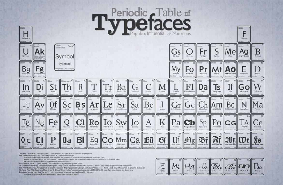
Font Selection and Usage Guidelines
1. Readability and Simplicity: The fonts chosen should increase readability and present a simple appearance. Fonts should be consistent with the brand and provide a professional appearance. The use of fonts such as Comic Sans can undermine the seriousness of the brand, so careful selection should be made.
2. Line and Paragraph Spacing: Line spacing of texts directly affects the readability of the text. There should be sufficient space between lines; It should not be too close or too far. Leaving a line space between paragraphs makes the text look more organized and readable.
3. Bullet Points: It is important to maintain consistency in lists and bullet points. Bullet points should be short and simple, and if more than one line is used, the lines should be aligned.
Font Styles and Uses
1. Normal Type (Regular)
Usage Areas: It should be used in correspondence, explanations, contact information and general texts.
Features: It should provide a clean, readable and professional appearance.
The main body of the texts should be written in this type.
2. Semi-Bold Type (Medium)
Usage Areas: Suitable for subheadings, subheadings and important details.
Features: It should be a slightly thicker version of the normal type, but should not be as prominent as the heading. It can be used to highlight important parts of the content.
3. Bold Type (Bold)
Areas of Use: It should be used in headings and places where emphasis is required.
Features: It should be clearly distinguished from other texts and should present an eye-catching and strong appearance. Headings and important points should be written in this type.
4. Italic
Uses: Suitable for signatures, footnotes, short descriptions and in-text highlights.
Features: By presenting a slightly oblique appearance, it should create distinction in the text and be useful for additional information or notes.
Typefaces and font families play an important role in representing the brand in a professional and consistent manner. By complying with the above standards, you can ensure that your brand presents a strong identity in all kinds of correspondence and visual communication. Taking care in font selection and use strengthens the brand's image and ensures that your communication is effective.
3- Corporate Identity Design Materials
Corporate identity design includes a variety of materials that ensure a professional and consistent representation of a brand. These materials, which are considered standard for small and medium-sized companies, offer customizable and cost-effective options according to the sectoral needs of the brand. Here we have compiled the basic materials used in corporate identity design.
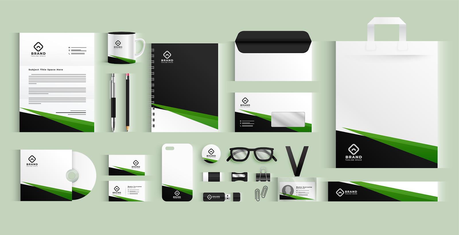
Business Card
Business cards are functional and professional materials that present the brand's contact information at global standards.
Measurement: It is 85 mm wide and 55 mm high as standard, and can optionally be used in vertical format.
Design: The logo is located in the upper left corner. Personnel information is located in the middle right section, and contact information is located in the lower section.
Paper: The thickness and weight of business cards should be in harmony with other corporate documents.
Letterhead Paper
Letterhead paper is an important material used in official correspondence and communication.
Measurement: 21 cm wide and 21 cm wide in accordance with global standards. It is prepared with a height of 29.7 cm (A4 size).
Design: The logo is usually placed in the middle and right corner. Contact information is also positioned in the same way. This arrangement increases the visibility of the logo and contact information when the letterhead is placed inside the folder. Paper quality ensures that the letterhead presents a professional appearance.
Continuation Paper
Continuation paper, unlike letterhead, does not contain contact information and is a professional corporate communication material.
Dimensions and Features: It is the same size as a letterhead. It is used for ongoing texts or contents.
Design: There is no contact information, so it is suitable for continuation of texts and contents.
Diplomat Envelope
Diplomat envelopes are an important material used in both internal and external correspondence.
Measurement: They are generally 11 cm high and 24 cm wide. However, different sizes are also available.
Design: The logo is located in the upper left corner of the envelope. Contact information starts 1.5 cm above the bottom left corner. Diplomat envelopes can be offered in two types, with and without windows.
Presentation File
Presentation files are materials that create a professional image and enable documents to be presented in an orderly manner.
Measurement: It is 440 mm wide and 310 mm high as standard, and can be produced in different sizes.
Design: There is a brand logo on the front of the file. When buying, there is contact information on the back. Printing can be applied to the inner and outer faces. Additionally, additional sections such as business cards, CD holders and pen holders can be included. Special knife designs can be made according to the needs of the brand.
Corporate identity design materials play an important role in representing the brand in a professional and consistent manner. Every material, from business cards to presentation files, should be designed to strengthen the brand's image. The details that need to be taken into consideration in the design of these materials help the brand achieve a professional appearance.
4- Official Documents That Must Be Included in Corporate Identity
In corporate identity design, officially valid documents of the brand are of great importance. These documents both create a professional image and meet legal requirements.
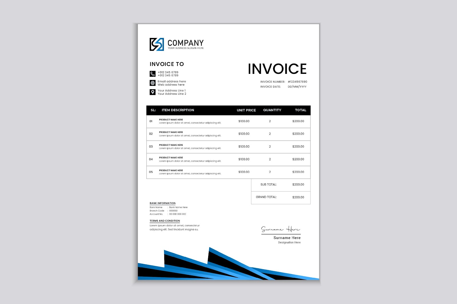
1. Invoice
Invoice is the basic document documenting the official communication and financial transactions of the brand. The brand logo is located in the upper right corner of the invoice, and contact information and other official information are located below it. Invoice dimensions must match the paper size of the printing printer used. Invoices used as continuous forms are prepared according to the size of printer paper. Invoices used in color laser printers are usually A4 size and can be autocopied. It can also be designed as a delivery note, so that the delivery of materials and financial records can be better tracked.
2. Shipment Note
Shipment note is an important official document documenting the shipment of goods. The brand logo is on the right side of the delivery note, just below the contact and official information, and correspondence information and other official information are on the left corner. The delivery note consists of four main headings: description, quantity, unit, packaging status. In the lower section, there are signatures and date information of the recipient and delivery person. It can coexist with the invoice design, thus ensuring that both the invoice and the delivery note are issued together.
3. Collection Receipt
Collection receipt is the document that officially documents the payments. Collection receipts, generally A5 size, are designed in accordance with standard layout rules. It can also be used as a cash collection receipt. It must have standards compatible with all documents.
4. Expense Compass
The expense slip keeps a record of non-taxable expenses. It is used to keep records of trade or services made with individuals who are not subject to tax. The design of the expense slip ensures that relevant expenses are officially recorded.
5. Expense Documentation Form
The expense documentation form ensures that expenses within the institution are officially kept. It is usually prepared in A5 size. The form contains details of the expense incurred, its date, and the name and signature of the person who issued the document. Company information is located in the upper left section of the form.
6. Check Slip
Check slip is used to keep written check dates and related information. It has standard content and plays an important role in the management of checks. Check dates and other details are clearly stated on the payroll.
7. Stamp
Stamp is a type of seal that serves as approval and signature on official documents. The design of the stamp may have different sizes and contents depending on the area where it will be used. Generally, the company name, contact information and tax identification information are included on the stamp. The logo design can be used in color to harmonize with the corporate identity. Stamp represents the approval and signature authority of the brand in official documents.
5 – Create Corporate Identity in Steps!
1. Developing a Corporate Identity Strategy
Determine the long-term goals and main purpose of the brand. Define the core values that reflect the brand's culture and way of doing business.
2. Creating a Brand Identity
Design the company name and logo. It is important that the logo reflects the brand values and personality. Brand colors and fonts should be determined. This provides a consistent visual identity. Develop a slogan that conveys the company's message concisely and effectively. Determine your communication language.
3. Creating a Corporate Identity Guide
Create a guide that includes instructions such as how to use the logo, how to apply colors and fonts. Provide information on how to use corporate identity elements on various platforms such as business cards, websites, social media, and in-office materials.
4. Internal and External Communication Strategy
Ensure the internalization of corporate identity by establishing effective communication with employees and internal stakeholders. Establish a consistent and effective communication strategy with customers, suppliers and other external stakeholders.
5. Implementation and Monitoring of Corporate Identity
Implement corporate identity in all communication materials and applications in line with the established rules and guidelines. Regularly monitor the effectiveness of the corporate identity and make updates as necessary. Corporate identity strengthens the company's image, increases brand awareness and helps establish a strong bond with the customer.
To be created and implemented correctly and consistently Performance marketing agency BusinessUp strengthens your position in the market and establishes a strong bond with the target audience.


