
Colors have an important place in every aspect of our lives. Whether you're planning to decorate a room or designing a website, choosing the right color combinations is critical to achieving an aesthetically pleasing and balanced look. The harmony of colors is of great importance in terms of both providing visual balance and directing the emotions of the viewer. So, which colors are compatible with which colors? The answer to this question is hidden in some basic principles based on color theory and the color wheel.
Ensuring color harmony is one of the basic elements of a successful design. The color wheel is a powerful tool for understanding the relationships between colors and choosing appropriate combinations. Different color combinations can be used to create specific aesthetic and emotional effects. Here are the basic color combinations and their effects:
1. Complementary Colors (Complementary Colors)
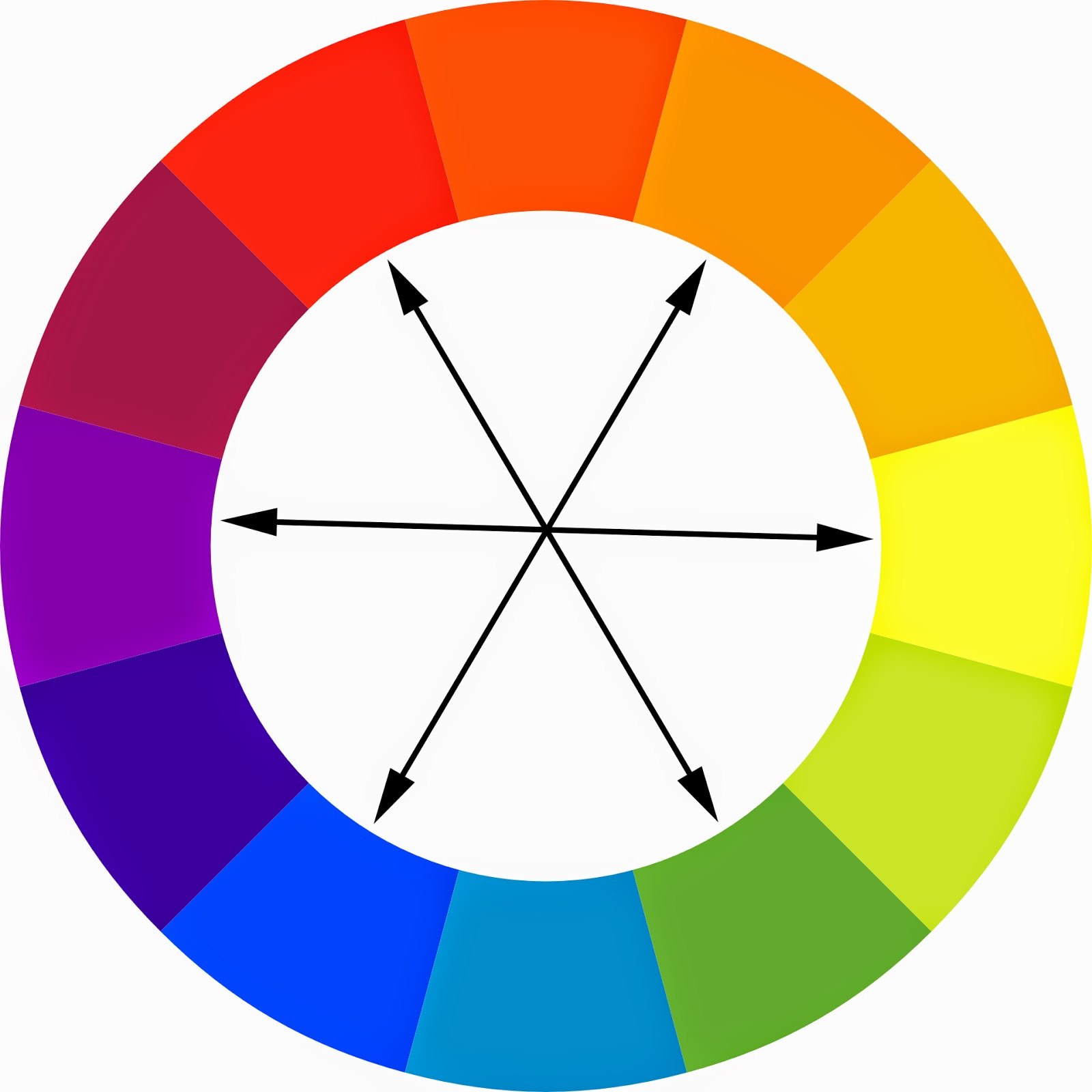
Complementary colors are colors that are opposite each other on the color wheel. When these colors come together, they create a strong contrast and provide a striking appearance. For example, combinations such as red and green, blue and orange, purple and yellow are ideal for attracting the viewer's attention and creating a dynamic effect. Complementary colors can be used as a powerful tool, especially in designs where you want to create emphasis.
2. Analog Colors
Analog colors consist of colors located next to each other on the color wheel. These colors provide a softer and more harmonious look when used together. This color harmony, which is frequently found in nature, is perfect for creating a calm and peaceful design language. For example, colors such as blue, blue-green and green can reflect the natural harmony of nature, giving the viewer a relaxing feeling. Analog colors are an ideal choice, especially for designs that seek peace and balance.

3. Triadic Colors
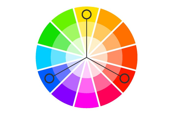
Triadic colors consist of three colors equally spaced on the color wheel. These combinations are suitable for dynamic and eye-catching designs, providing a lively and energetic look. For example, triadic combinations such as red, yellow and blue or purple, orange and green add energy to your design and provide the viewer with a powerful visual experience. Triadic colors are generally preferred in projects that appeal to a young and dynamic target audience.
4. Monochromatic Colors
Monochromatic colors are created by using different shades of the same color together. This approach is ideal for creating a minimalist and sophisticated aesthetic. For example, dark blue, medium blue and light blue tones allow you to achieve a simple but stylish look. Monochromatic color palettes are a great choice when you want to make an elegant and professional impression. These combinations can be especially effective when you want your brand to present a modern and sophisticated image.

5. Basic Color Combinations
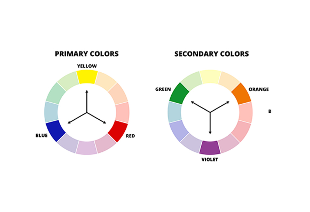
The basic colors red, blue, and yellow are the starting point of the color wheel and are used to derive all other colors. These colors are often preferred as strong accent colors and create a balanced combination with other secondary colors. Combining basic colors can create striking and eye-catching designs. These combinations can be used in designs specifically aimed at children or younger audiences.
6. Secondary Color Combinations
Secondary colors are green, orange, and purple colors obtained by mixing primary colors. These colors offer a more balanced and refined palette. Combinations with secondary colors are perfect for creating a sophisticated and elegant design language. For example, the combination of green and purple creates a rich and luxurious aesthetic. Such combinations are especially preferred in projects that appeal to a mature and selective audience.
When choosing color combinations, it is important to consider the purpose of the design, your target audience, and the message you want to convey. Knowing which colors evoke which emotions can help ensure color harmony. The right color combinations largely determine the overall aesthetics of the design and its impact on the viewer, so being conscious and strategic in color selection is critical to the success of the design.
Ensuring that colors harmonize with each other is the foundation of creating aesthetically successful and emotionally impactful designs. Different color combinations such as complementary, analog, triadic and monochromatic colors should be used correctly according to the purpose and target audience of the design. Using the power and impact of colors correctly ensures the best management of both visual balance and the emotional response of the viewer. By paying attention to color harmony, you can take your designs to the next level and provide your audience with an impressive and unforgettable experience.


